Logo Design Evaluation Framework: 5 Criteria to Evaluate the Quality of a Logo (+ Canva Template)
Let’s be real—logo design is way more than just creating something that looks cool. Sure, a logo needs to be aesthetically pleasing, but that’s only part of the equation. Your logo is one piece of a larger puzzle and should be designed with functionality and versatility in mind. I’ve seen designers fall into the "golden ratio" rabbit hole, creating visually stunning logos that don’t quite work in the real world. We’re talking logos that look great on paper but flop when it comes to practical use, like slapping them on packaging, social media icons, or billboards.
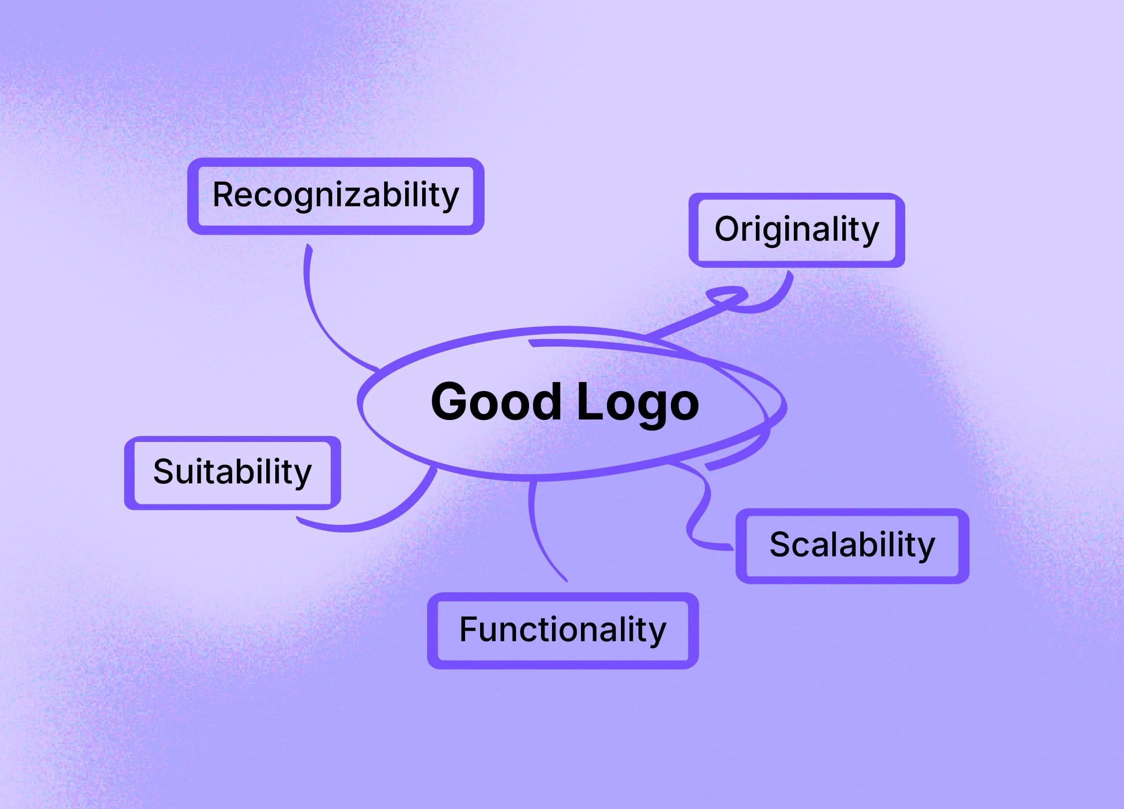
That’s why I created my own evaluation framework to keep things grounded. Let’s walk through the 5 criteria that will help you judge whether your logo is more than just a pretty face.
Criteria 1: Recognizability
At the end of the day, if no one remembers your logo, it’s game over. Recognizability is key. Your logo should be simple enough to be remembered in a flash, but distinct enough to stand out.
👉🏽 One way I like to test this is by cutting the logo into smaller pieces—can you still tell what it is if half of it is gone?
👉🏽 Another fun exercise is the 5-second test: show it to someone, then ask them to draw it from memory. If they’re close, you’re golden. If they can only scribble out a vague shape… back to the drawing board.
Criteria 2: Originality
Originality means that your logo shouldn’t be a remix of a thousand others. Not to say that you can't get inspired by what's out there, but don't copy! You want it to be unique, but not too out there—there’s a sweet spot.
👉🏽 Do an image search with Google Lens and the Word Intellectual Property Organization (WIPO) to ensure you’re not stepping on anyone else’s brand toes.
👉🏽 And don’t forget to compare it to your competitors' logos. You want to find that balance between standing out and fitting in, known as points of difference vs. points of parity. In other words, be different enough to catch eyes, but familiar enough that it feels right for your industry.
Criteria 3: Scalability
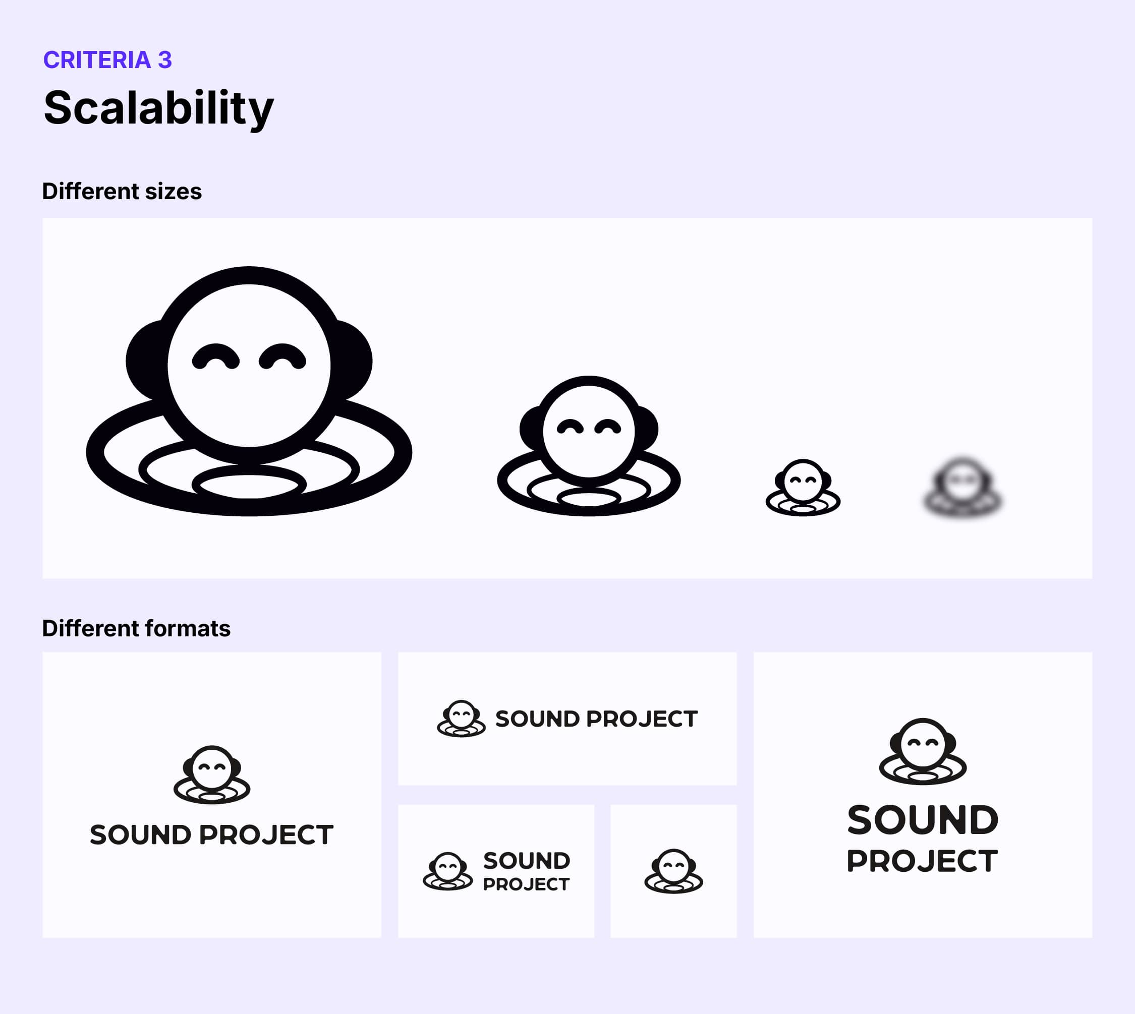
Logos live in a lot of places — business cards, websites, billboards, you name it. Your logo has to look sharp and recognizable no matter the size.
👉🏽 Test it by scaling it up and down, and try adding a blur—does it still look good? Can people tell what it is even if it’s the size of a postage stamp?
👉🏽 And let’s not forget about format: does your logo work horizontally, vertically, and in a square?
If you’re stuck with only one usable version, you’ll be pulling your hair out when the client asks for 20 variations. And what's more — it won't meet all the real-life use cases any logo will have to fit into over the next many years.
Criteria 4: Functionality
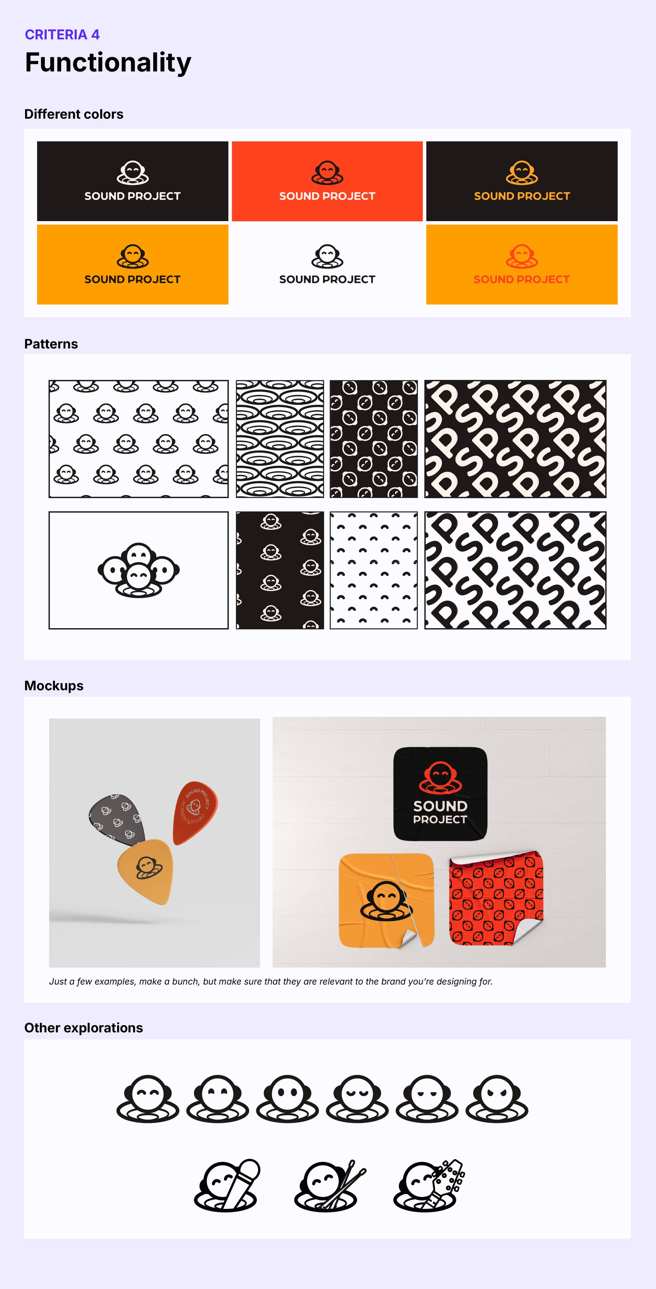
This is where many “beautiful” logos crash and burn. A functional logo needs to work in every scenario you can imagine (and a few you can’t).
👉🏽 Test it on different backgrounds and in various color schemes.
👉🏽 See if the logo mark can be used independently as design assets or patterns.
👉🏽 Does it play nice with a tagline or should it be adaptable for different brand branches with slight modifications?
👉🏽 Mockup, mockup, mockup… make sure to mock up the logo on anything you think is relevant for the brand (merchandise, social media, app icons, website, etc.).
Think about all the potential contexts—it’s not just about looking pretty in a portfolio, it’s about thriving in the wild.
Criteria 5: Suitability
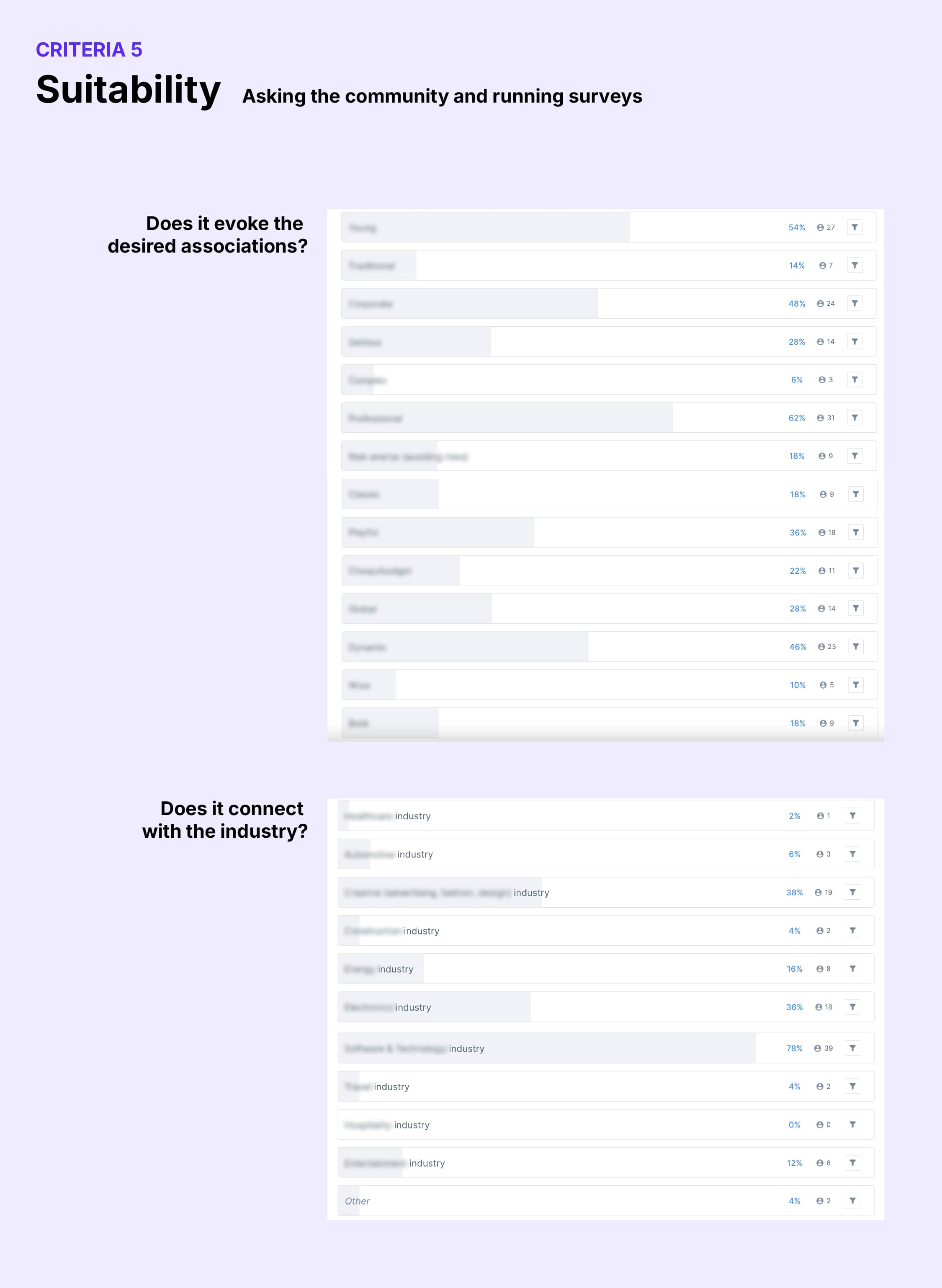
Here’s where the logo has to answer some tough questions: Does it fit the brand? The industry? The audience? A tech startup logo shouldn’t look like it belongs to a vintage bakery (unless that’s your vibe, of course). To get a feel for how well your logo fits, go straight to the source—your audience.
👉🏽 I use closed designer groups on Reddit or Facebook to crowdsource feedback. Give context and images of different use cases for the logo.
👉🏽 Then I run targeted surveys on platforms like Maze or Lyssna. Ask questions about what the viewer thinks the brand does, which feelings/associations they get after seeing it, and maybe throw in a classic "if this was a person, what personality trait would you say they have?".
You’ll get insights that you might have missed on your own, like what emotions the logo stirs up or how it makes people feel about the brand.
That's it!
A logo isn’t just a shiny badge for your brand. It’s a functional asset that needs to work hard in a variety of environments. By using this 5-criteria framework, you can ensure your logo design stands the test of time—and use.
Make sure to not just do this to tick off boxes - listen with an open and unbiased mind to the feedback you get, while still balancing the fact that you are an expert. Odds are that you will change some things after going through these criteria, but you should not loose confidence in your own skills as a designer!
Want to try it out for yourself? I’ve created a Canva template to help you evaluate your own logos. Check it out here.
Now go forth and create logos that work as great as they look!


